
Fed up with spreadsheets and old-school software that suck up your time, do nothing for strategy, and ultimately leave everyone confused and cursing the ever-growing stack of disconnected tools? It sounds like you need one of the best reporting tools. No, wait, you deserve the best.
Most people who come to us have already been down the hard road. You might feel their pain:
- Wasting countless hours managing reports across multiple spreadsheets.
- Constant battles to keep information accurate and up-to-date.
- Endless struggles to keep all teams connected.
- Zero clarity on how key performance indicators (KPIs) impact company goals.
- No clear way to track strategy progress or drive daily action on goals.
- Sacrificing the clarity you need in board reports to provide confidence to leaders about the company’s progress.
There has to be a better way to do reporting, right?
In this article, we’ll explore some of the best options for reporting, including dedicated reporting tools and business intelligence software. First, let us tell you more about Cascade, our own strategy execution platform for mastering business reporting in line with strategic objectives.
Cascade: #1 Strategy Execution Platform To Connect Reporting To Strategy
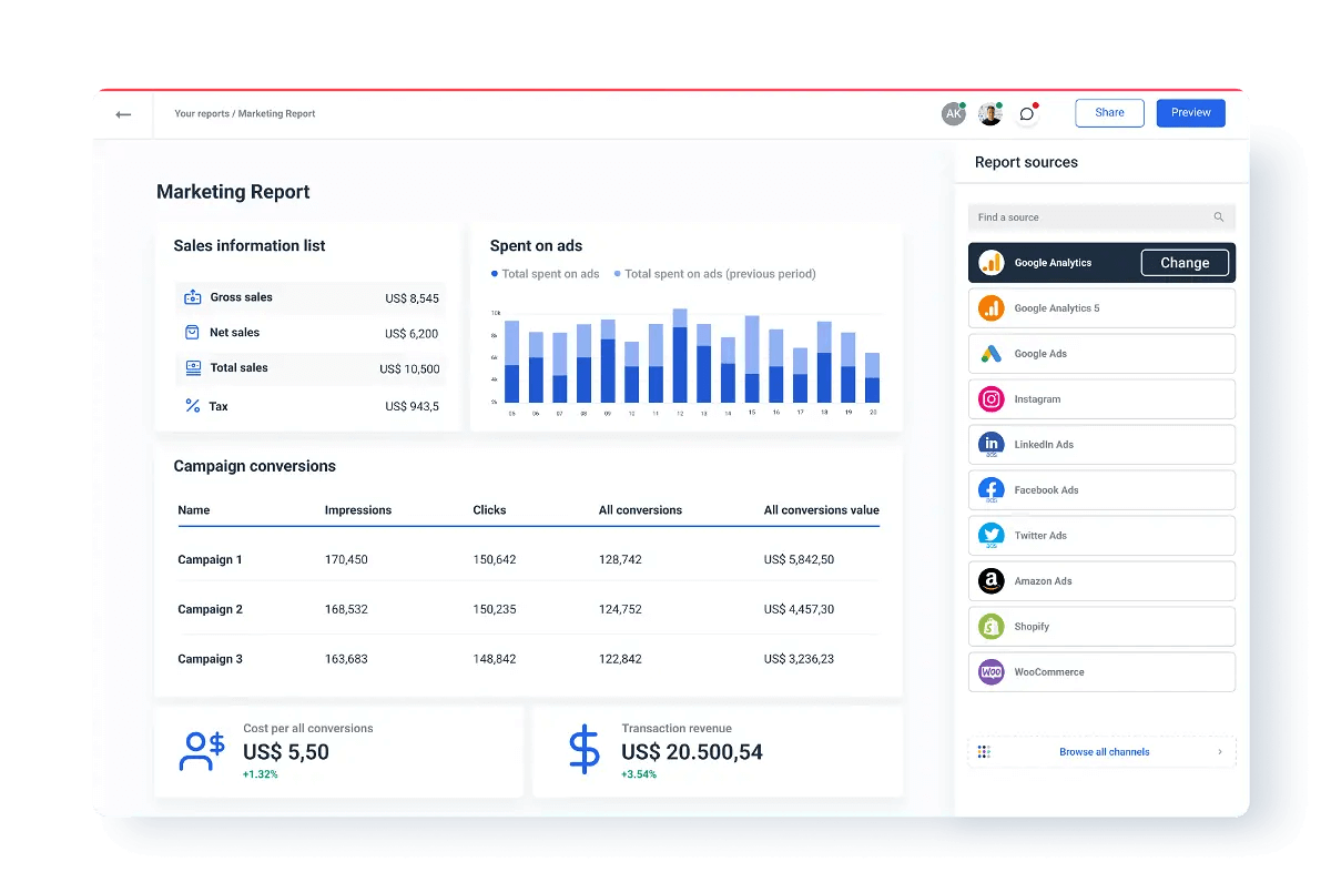
.png)
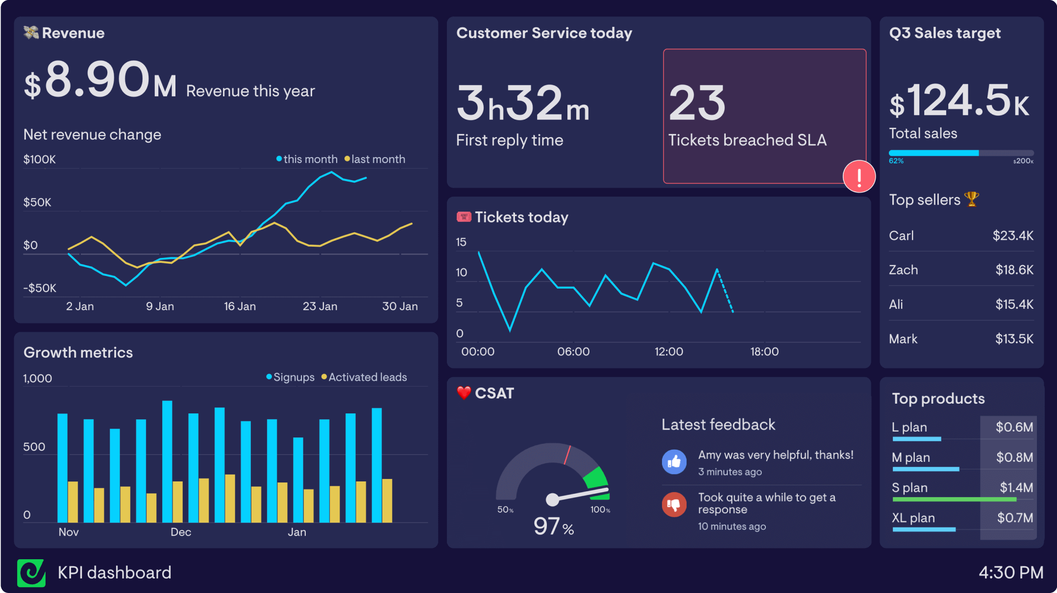
Cascade is more than just a reporting platform. It has the functionalities of a reporting software, but as a strategy execution platform, it helps companies track and measure the metrics that matter and connect reporting insights with strategic objectives—all in one place. As this platform offers strategic context for each KPI, OKR, and daily activity, business leaders can see faster results from their strategy and make data-driven decisions.
Key features and benefits of Cascade for reporting:
- User-friendly interface: From the drag-and-drop builder and smart notifications to excellent customer support, Cascade makes it easy for everyone to get involved in performance management.
- Single source of truth: With over 1,000 integrations, you can connect Cascade with other project management tools, apps, or reporting solutions, including SAP ERP, Salesforce, PowerBI, Excel, and Google Sheets. Cascade acts as your organization’s brain, so you can view all your business insights without hopping around multiple tools.
- Improve team alignment: Whereas many reporting platforms only offer an isolated view of metrics, Cascade's Alignment Maps feature connects data points with strategic objectives. This approach ensures every team is on the same page and every team member understands how their efforts contribute to the company's success.
%20(1).png)
- Customized dashboards and reports: Easily create dashboards and reports for specific use cases, teams, or projects. This way, you can turn complex data into easy-to-understand, visual dashboards that your teams can use to work together on shared goals, enabling cross-functional collaboration.
.png)
- Real-time data and tracking: Get the most current information about performance and progress with Cascade’s Metrics Library. Alongside the automated reporting feature, real-time monitoring helps you create better, faster reports on performance, as you can improve the accuracy and relevance of ad-hoc reporting.

- Automated metrics calculation: You can combine any metrics data connected to Cascade from any data source to create a new calculated or aggregated metric. This new aggregate metric will be the roll-up of the related child metrics. Connect it to your strategic plan and achieve improved business observability.
- Interactive data visualizations: Like other visualization tools, Cascade enables your team to glean quick, actionable insights and get more value from meetings by presenting data in intuitive visual formats, like pie charts, graphs, heatmaps, and KPI scorecards. What distinguishes Cascade is its guarantee of keeping these visuals in line with your overall strategy.
- Export your reports in PDF or Excel (CSV) format and share them with external stakeholders to enhance collaboration!
- Drill-down capabilities: Identify bottlenecks and their causes, from top organizational goals to KPIs to projects and initiatives. With this functionality, you can reduce resource wastage in dead-end strategies and maximize efficiency.
Who is Cascade for?
Cascade's powerful integrations and customization capabilities make it a perfect choice for any team that is serious about performance, in a startup, a mid-sized business, or an enterprise. Its easy-to-use interface makes it ideal for non-technical users, so your IT team can take a break! Cascade customers come from many industries, including manufacturing, automotive, consumer goods, healthcare, supply chain and logistics, retail and clothing, and banks and finance.
Reviews
4.8 stars out of 5 on G2
Pricing
- Free forever plan for smaller teams (up to 4 users).
- Essentials plan: Get a tailored pricing based on your organization’s needs—ideal for companies looking to centralize their strategy execution in a digital format, with a little help from our team of experts.
- Enterprise+ plan: You get a customized proposal based on your business needs—perfect for organizations looking to uplift their strategy, partnering deeply with Cascade’s strategy experts to transform their execution.
👉🏻 For more details about Cascade’s plans & offerings, check our pricing page.
Are you ready to see Cascade’s powerful reporting capabilities in action? Book a 1:1 demo with one of Cascade’s strategy experts.

Reporting Tools
A reporting tool is a SaaS platform that connects with data sources, gathers information, and provides business intelligence in a range of display formats, such as tables, graphs, charts, and interactive data visualizations. Most reporting platforms cover specific use cases, like financial reporting, sales, or marketing performance.
While they do have some benefits, there are also challenges to consider before choosing a reporting tool:
- Lack of strategic insight: While reporting software allows you to set goals and track progress, most don't explain how initiatives and day-to-day activities relate to strategic objectives.
- Pricing: Many reporting tools have restricted features on the lower tiers, with access only available for a few business users. The higher tiers with more dashboards are often too expensive.
- Digital overwhelm: Even if you have one of the best reporting tools, you add another tool to your tech stack. That's one more thing for your teams to keep an eye on—and they'll still have to track strategy in a separate platform.
📚 Recommended read: check out our blog article What Is A KPI Report & How To Build One
Plecto

Plecto is a business performance platform that combines KPI visualization, gamification, and coaching tools in a single solution. Users have access to over 50 pre-built integrations and a public API, which gives them a holistic view of performance data across multiple departments, teams, and systems.
Key features & benefits
- Real-Time reports: Keep tabs on performance with in-the-moment insights across all KPIs.
- Unlimited data sources and dashboards: Data connectors to pull data from other tools, social media, and third-party sources to present the complete picture to your teams.
- Automated report generation: Save time by automatically creating detailed business reports within minutes.
Who is Plecto for?
This platform is aimed at mid-market and large enterprises that need real-time knowledge of their performance across sales, service, marketing, and finance. Some users have found it challenging to set up and use, so it may not suit organizations that want to give everyone access to reporting tools.
Reviews
4.1 out of 5 stars based on G2
Pricing
There are 3 paid plans available:
- Medium: starts at $275/mo with the first 10 licenses included + additional cost of $27.50/mo per new license
- Large: starts at $430/mo with the first 10 licenses included + additional cost of $43/mo per new license
- Enterprise: Minimum 100 licenses. Contact the Plecto sales team for a custom quote.
Geckoboard
Geckoboard is a live KPI dashboard platform that helps users streamline data insights from multiple sources. With intuitive features like status indicators, scheduled screenshots, widget filters, and looped dashboards, reporting becomes easy.
Key features & benefits
- User-friendly interface: The simple layout helps your teams make business data understandable without using any code.
- Easy to collaborate: Dashboards are easy to share, embed, and work on together.
- Smart display options: Focus on the metrics that matter by selecting the best ranges and filters for every report. You can toggle the visualization options to display data in a way that makes sense to your team.
Who is Geckoboard for?
Geckoboard offers dashboards for a range of use cases, including investors, marketing, sales, support, and e-commerce. It’s particularly useful for smaller businesses getting started with data analysis. However, its 80+ integrations may still be limited for companies that want to connect more data sources and tools.
Reviews
4.3 out of 5 stars on G2
Pricing
- Free plan: 14 days free trial
- Essential: $49 per month—3 users
- Pro: $99 per month—10 users
- Scale: $699 per month—25 users
Whatagraph
Whatagraph is a web-based reporting tool that lets marketing teams and agencies create beautiful reports in minutes instead of hours. You can automatically pull data from over 40 sources to compile engaging visual representations of marketing data and analytics.
Key features & benefits
- Integrations: Monitor and compare performance data across multiple channels and campaigns—live, all in a single platform. It integrates with CRM tools like Hubspot and Salesforce, along with tools to track SEO, social media, and paid advertising efforts, among others.
- Automatic delivery: Schedule daily, weekly, or monthly marketing reports and automatically send them to ensure everyone stays on track.
- Customize report style: Add custom themes, corporate logos, and brand colors.
Who is Whatagraph for?
Whatagraph is predominantly used by marketers, including digital marketing agencies, freelancers, and in-house marketing teams. While it's one of the best reporting tools for marketing analytics, the limited capabilities for strategy tracking may frustrate some users.
Reviews
4.5 out of 5 stars on G2
Pricing
No free plan available; paid plans (billed annually) start at:
- Professional: $223/mo
- Premium: $335/mo
- Custom: For big marketing agencies—contact their sales team for a tailored quote.
Workiva
.png)
Workiva is a cloud-based platform for financial reporting. This software brings raw data together in a single ecosystem, which automates manual processes for various financial activities, including budgets, forecast reporting, and statements of cash flows, income statements, and balance sheets.
Key features & benefits
- Give everyone access & permissions: Use a central system to manage key assets, like flash and KPI reports, product line and business unit reports, CFO decks, and covenant reports.
- Automate reports and workflows: Save time and resources with built-in automation to speed up repetitive tasks and manage regulatory and financial reporting processes.
- Easy data sync: Automatically update your data across multiple documents in real-time by linking to each other—no more wasted time on manual edits and less risk of duplication.
Who is Workiva for?
Its focus on regulatory, financial, and ESG reporting (environmental, social, and governance) make Workiva a niche tool. It's popular in multiple industries like IT, insurance, investment, banking, energy, and utilities, but it comes with a steep learning curve that won't suit all companies.
Reviews
4.5 out of 5 on G2
Pricing
Their website does not disclose pricing.
BI Reporting & Analytics Tools
Business intelligence tools, also known as BI platforms, often use artificial intelligence (AI) and machine learning to pull data from various sources, organize it, and visualize it in ways that make the data easier to analyze and understand. These visual reports can be printed, presented, and used to guide business decisions.
Despite these benefits, in terms of reporting on progress related to strategic goals, BI tools have a few limitations:
- Isolated metrics: You can view your KPIs and OKRs, but it is not connected to the business goals and vision in a clear, coherent way (like Cascade).
- Project status visibility: You can’t track project status with these tools to quickly gauge what projects are on track or where potential bottlenecks are holding up progress.
- User interface: Many BI tools come with a steep learning curve, as many of the advanced features aren’t something a new user will be able to handle.
Let's look at some of the best options for business intelligence platforms in 2024.
💡ProTip: To avoid these limitations, you might opt to use a BI tool and integrate it with Cascade. This way, you’ll be able to connect your most important KPIs and metrics to your strategic objectives and initiatives for data served with context, aligned and visible across your organization. Your strategy’s progress will automatically update in Cascade when data in your BI tool changes.
Tableau

Tableau is an AI-powered business intelligence tool that helps companies create interactive reports and data visualizations. Users can create AI-driven statistical models and visual dashboards to help everyone understand reports and get more actionable value from data. Additionally, Tableau's analytical capabilities enable predictive analysis, including forecasting, within a visual analytics interface.
Key features & benefits
- Centralized dashboard: Ensure team alignment with a single view that has everything in one place.
- Interactive dashboards: Interactive visualizations that capture people’s attention and make it easy to explain data.
- Real-time reporting: Keep everyone up to date with the live status of your KPIs.
Who is Tableau for?
With its user-friendly interface, this platform is used by students, data analysts, and business owners across a range of industries. However, with its expensive license and the need for some advanced knowledge to maximize the value of the platform, Tableau may not suit companies that are just getting started with data reporting.
Reviews
4.4 stars out of 5 on G2.
Pricing
- Tableau Viewer: $15 user/mo
- Tableau Explorer: $42 user/mo
- Tableau Creator: $70 user/mo
Zoho Analytics
Zoho Analytics is a data analytics software and self-service business intelligence platform where users can create visualizations, analyze data, and discover hidden insights. You can pull data from over 250 sources and present end-to-end insights with engaging data storytelling.
Key features & benefits
- Reporting options: You can display reports in many ways, including charts, pivot tables, tabular, and summary views.
- Drag and drop: This intuitive report designer feature makes it easy to construct reports.
- Share the reports and dashboards: Democratize your data, share information with the team, and allow for comments and collaboration.
Who is Zoho Analytics for?
This platform is a good option for customer relationship management—especially for small businesses who want to take advantage of the lower-priced tiers. There have been some reports of delays in the real-time updating of the metrics, which may pose a problem for companies that need regular, fast, and accurate data insights.
Reviews
4.2 stars out of 5 based on G2
Pricing*
- Basic Plan: $30/mo
- Standard Plan: $60/mo
- Premium Plan: $145/mo
- Enterprise Plan: $575/mo
*Pricing disclosed in their G2 account differs from the pricing disclosed in their website.
Databox
Databox is a business analytics platform that helps companies create and track KPIs, assess performance, and guide decision-making. With a single interface to view all their key metrics, it’s easy to monitor progress and adapt your company strategy and daily actions in line with the data insights.
Key features & benefits
- Integrated dashboard: Mix and match KPIs from a variety of different sources into a single dashboard.
- DIY dashboard designer: Build your own customizable dashboards to track KPIs and set up custom views for your team.
- Integrations: Automatically connect your reporting software with the rest of your tech stack, including tools for marketing, social media, and sales.
Who is Databox for?
Whether you’re a sales rep, marketer, analyst, or CEO, the clear, easy-to-use interface helps combine and analyze data from a lot of sources. One caveat is that while it’s possible to manage all your goals from one screen, you won’t get the context of how those goals align with the bigger picture. As such, it’s better for data tracking, not strategy progress tracking.
Reviews
4.4 stars out of 5 on G2
Pricing
- Free-forever account, which includes all standard features
- Starter: $59/mo
- Professional: $169/mo
- Growth: $399/mo
- Performer: $999/mo
SAP Crystal Reports
.png)
SAP Crystal Reports is a business intelligence tool that can transform raw data from almost any source into interactive, actionable information. This software helps companies create advanced reports and provides access to people online or offline from portals, applications, and mobile devices.
Key features & benefits
- Easy sharing: It’s simple for everyone in the organization to access, view, format, and study data.
- Personalized reports: You can build reports in your preferred language and format.
- Export capabilities: Users can export vast reams of data to a single worksheet without the need to create multiple spreadsheet files.
Who is SAP Crystal Reports for?
This platform aims to provide intelligent reporting to small businesses. Given the slightly complex interface, new users may find this platform a challenge to set up. If you, or someone on your team, has some programming knowledge (in SQL and .NET), you will get more value from the embedded analytics and advanced features of SAP.
Reviews
4.2 out of 5 stars on G2
Pricing
Entry price is $495/user
Power BI
Microsoft Power BI is a cloud-based business intelligence tool that enables teams to create and share visual KPI reports. Its emphasis on customization helps people build focused reports for specific projects and use cases so everyone in the organization can turn data into an actionable tool for their day-to-day work.
Key features & benefits
- Lots of visual report options: Power BI has a library for custom visualizations and great reporting options, like column, waterfall, pie, scatter, and ribbon charts.
- Navigation: It’s convenient for users to navigate between datasets, the current dashboard they are working on, and any reports they are creating.
- Cloud-based: You can provide instant access to your data visualizations across multiple locations so that teams can collaborate on shared documents.
Who is Power BI for?
The steep learning curve makes Power BI best suited to data analysts and business intelligence professionals who will create data models and share them with others in the company.
Reviews
4.4 stars out of 5 on G2
Pricing
- Power BI Pro: $10 user/mo
- Power BI Premium: $20 user/mo
- Power BI Premium: from $4,995 capacity/mo
Looker

Looker—formerly known as Google Data Studio—is a web-based and browser-based BI tool by Google that enables organizations to build insight-powered workflows and applications, and explore, analyze, and share business analytics.
Key features & benefits
- Integrated with Google data sets: As part of the Google Cloud ecosystem, Looker leverages the power of Google's advanced analytics and machine learning capabilities.
- Customizable data experiences: Looker empowers users to create tailored, interactive dashboards and reports, transforming raw data into insights.
- Look Modeling Language (LookML): This declarative language—based on SQL—streamlines collaboration, ensuring a shared understanding of data structures and transparency in data modeling.
Who is Looker for?
Looker is tailored for data analysts, scientists, business intelligence professionals, decision-makers, and developers across a spectrum of organizations—ranging from small businesses to large enterprises—that prioritize a data-driven culture.
Reviews
4.4 stars out of 5 in G2
Pricing
The standard monthly subscription for Looker (Google Cloud core) costs $5,000/month. For other multicloud options—like Looker Embedded, Looker Modeler, or Looker Studio Pro—you need to contact their sales team for tailored pricing.
Sisense
.png)
Sisense is a business intelligence (BI) and data analytics platform that enables organizations to gather, analyze, and visualize data from various sources, transforming data into actionable insights.
Key features & benefits
- Unified data integration: Sisense seamlessly integrates diverse data sources, whether on-premises or in the cloud, providing a unified view of organizational data.
- Visual analytics: Provides powerful visualization tools, allowing users to create dynamic and interactive reports and dashboards.
- AI-powered insights: Advanced analytics features, including predictive analytics and anomaly detection, enable teams to make proactive, data-driven decisions.
Who is Sisense for?
Sisense is a good choice for organizations on the lookout for a comprehensive big-data reporting solution that not only harnesses the power of machine learning but also boasts advanced automation features.
Reviews
4.3 stars out of 5 in G2
Pricing
Sisense doesn’t provide pricing on its website. You need to contact their team for a quote.
Is Microsoft Office Suite One Of The Best Reporting Tools?
It's no secret that we aren't big Excel fans here at Cascade. But for all the spreadsheet lovers, we'll look at what Microsoft can offer. We know your CFO has been waiting for this one. So, what are Excel’s capabilities in terms of automating reporting and data integration?
Microsoft Excel can do more than simple spreadsheets—if you know how to get the most out of formulas and have some coding skills. It’s possible to consolidate multiple files to create a robust CRM platform or financial reporting system that gives you an overview of your metrics.
A couple of leading investment banking firms in the U.S. did this when they joined forces. Of course, they had to hand-code everything in Python. Although it helped them transform their systems, it wasn’t built for collaboration. They couldn’t share the process with other teams, and it severely hampered data analytics.
Key features & benefits
- Familiar: It’s widely available, as everyone who has ever owned a computer or taken an IT class at school or online will probably be comfortable with the basics of Excel.
- Support: You can find an endless pit of tutorials, guides, report templates, and forums online to learn advanced features.
- Free: As Excel comes with the Microsoft Office Suite, you can save costs by making it the de facto reporting tool in your company.
Cons
Excel and PowerPoint are handy for anyone to knock together a quick summary of their research. But when you want in-depth, accurate reporting, there is a long list of undeniable drawbacks. For example:
- Too slow: Requires lots of manual effort and frustrating edits.
- Too messy: It doesn't matter how good you color code that spreadsheet—it's going to get confusing when you have multiple tabs and documents.
- Prone to human errors: With all the manual tinkering, formulas can break, and disaster strikes.
- No real-time insights: Without accurate updates, it’s harder to make smart, timely decisions.
- Harder to share: While they might do for presentations, Excel and PowerPoint are not built for collaboration.
We'll stop there. If you cling to old-school tools, you'll struggle to evolve. The best reporting tools offer greater visibility into your data to guide data-driven decision-making and drive effective work. Microsoft Office is not the right tool for that.
💡Pro Tip: If your data lives in Excel, our suggestion is that you look for a reporting tool that integrates with Excel so you can import your data in real-time and automate tracking and reporting. By integrating Excel with Cascade, you can establish a direct link between your information and your strategy, ensuring you have real-time insights into the progress of your strategic initiatives.
Choose The Reporting Tool That Helps Your Business Grow
The best reporting tools make data easy to understand, help you share insights on progress and performance, and guide business decision-making. However, they fall short when it comes to connecting KPIs and strategic goals.
When you give people more clarity on how their daily activities impact the company vision, you can improve team alignment and on-the-ground execution. The link between metrics and strategy means you can also drill down into the 'why' behind underperforming indicators to improve performance constantly.
If you want to bring your reporting, strategy, and people together, you need a user-friendly platform that makes it easy to create, share, and track custom reports in real-time, all in one place—without spreadsheet headaches. That’s what Cascade is all about. It’s the platform to drive more effective reporting and performance from the bottom-up and impress everyone from the top-down.
Are you ready to bring reporting and strategy together to drive better performance in your company? Book a free call with one of our strategy experts!