How to Create a Beautiful Mind Map - Principles, Examples, and Tips
Aug 30, 2019
How to Create a Beautiful Mind Map - Principles, Examples, and Tips
Aug 30, 2019
The mind map is a visual thinking tool. We use it to visualize our thoughts and get big pictures. When a mind map is complicated, the readability of the mind map is highly challenging to the audience.
Although it is okay if you only make mind maps for yourself, your audience might not think the same.
Today we will make the case of how to use features in XMind 2020 to draw beautiful mind maps.

The principles
Before diving into features, we can first take a look at four major principles from The Non-Designer’s Design Book. These four principles are the most fundamental in design. By thinking through these four principles, you can present key information more quickly, effectively, and intuitively.

1/ Proximity - Group related items inside the same group
Organize related elements together. For similar or related ideas, we can organize them by grouping or merging (boundary, summary, creating parent nodes, applying the same style, etc.,.). The principle of proximity not only helps your presentation but can force you to achieve the clearest organization ever.

The MECE principle (Mutually Exclusive, Collectively Exhaustive) is a good framework to review whether you classify and organize in the best way.
2/ Alignment - Organize different diagrams
Every element on the map should always align to a certain benchmark. With the alignment, no matter how complexed the information it is, the entire diagram is organized with a better visual association. If there are more free-style diagrams in your mind map, aligning them in a certain order will greatly improve the readability of the entire map.

Related features: Align Floating Topics
3/ Contrast - Highlight inside the same group
To differentiate between the primary and secondary levels, we can use contrasts of certain attributes, such as colors, shapes, sizes, lengths, fonts, thicknesses, and brightnesses. Differentiation makes your entire map richer in meanings.

Related features: Quick Style
4/ Repetition - Exert consistency across the entire map
Repeated elements of the design help achieve unity and strengthen audience' understanding of the map. This principle helps us connect all the other three principles. You need to design and plan, from top to bottom, about the patterns across the map. Once settled, keep it across the entire sheet.
We often find a mind map can go nasty if mind-mappers combine several ones into one. Not because merging maps is wrong, but that it would break the consistency in design patterns.

Related features: Quick Style
An example
With the four design principles in mind, let's look at a hand-drawn mind map and see what it does well and poorly.

What it does well
It takes good care of proximity, alignment, and repetition.
This map uses classic alignment: center aligning. It puts the strategy map at the top and the additional section at the bottom.
In terms of repetition, the strategy part displays consistency in branch shapes, text colors, and text sizes. The color orange highlights key topics for readers.
The branch color palette shows both repetitions (saturation and brightness) and contrasts (hues). This hand-drawn mind map shows good readability.
Things that need improvements
The contrast in text sizes are not big enough to create a clear visual and informational hierarchy. And the repetition usage of the color blue in two different branches might mislead readers to associate them.
All in all, it is a good-quality mind map.
Next, we will dive into XMind features that "beautifies" our diagrams.
Proximity and alignment - Structures and layouts
The structure is the backbone of a mind map, reflecting the logic of your thinking. Clear structure and outstanding focus can significantly improve the readability of mind maps.
However, we are not going to uncover the logic part in detail in the following guide. We highly recommend you to check out The Pyramid Principle for logic training.
Today we focus on visualization part of structures.
1/ Choose the right structures
XMind 2020 provides a variety of thinking structures in the software. But different structures have their pros and cons.
☆ Balanced Map: The most basic structure of mind mapping, which helps you to brainstorm more possibilities. But because the information is spread out, it is not easy for readers to tightly follow the logic sequence.
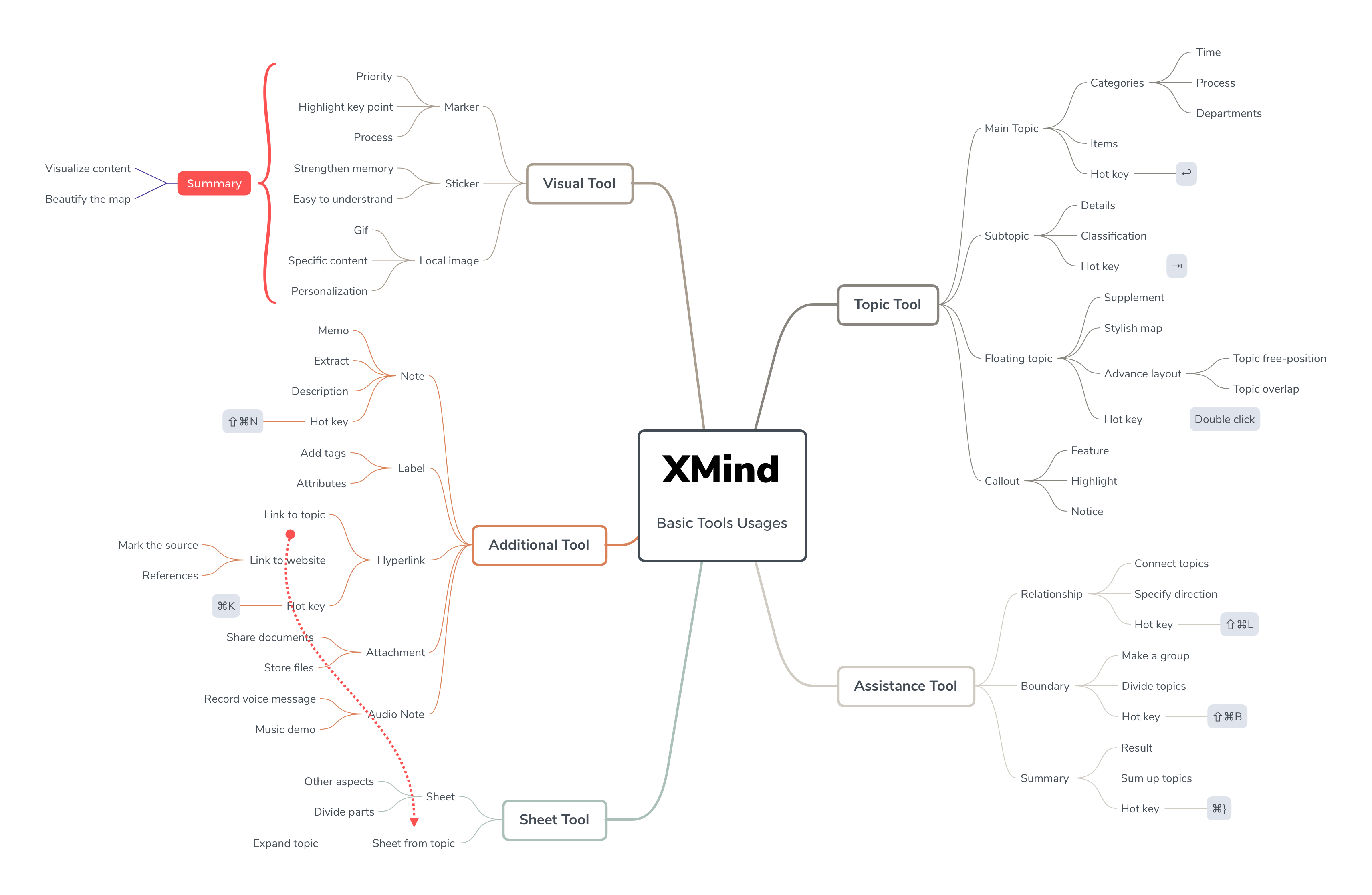
☆ Logic Chart: Narrowly speaking, the logic diagram only refers to a chart that displays formal logics. But in XMind, it is more like a single-sided mind map. It helps people to follow the logic sequence of the thoughts. However, the chart can get pretty long when you expand your ideas. It can be a bonus point if you read the map on the mobile, though.

☆ Timeline: A chart that indicates the sequence of events or procedures.

☆ Organization chart: A chart best for showing the hierarchy of a pyramid structure.

☆ Fishbone diagram: A more explicit expression of causality. Below is an example of using fishbone to debunk one problem in 5 levels. You may also put more elements to debunk, but it is hard to have more than three levels in that case. For the fishbone becomes annoying to read. Another downside of fishbone is the difficulty in connecting inter-branches relationships. You can learn more about fishbone chart and download the templates here.

☆ Matrix: A chart born for showcasing many-to-many relationships, including Kanban boards, product lineup comparison, and SWOT analysis. It is really powerful in that it is multi-dimensional. If you want to how on earth do we create SWOT and the weekly schedule below, you can check out an in-depth guide about XMind matrix here. You can download various matrix templates inside. While the diagram is mighty, it is trickier to use than other charts.

2/ Other tips
**Mixed structures. **Mixing different structures is an ideal solution for complex logic. Each branch in a map can turn into different structures. You can combine the various vertical and horizontal stretching charts to guide readers' attention.

**Auto-balance map. **When you use the balance diagram to diversify your thinking, you can turn on "Auto-Balance Map" to balance the layout.

How to use: Click on the blank area or central topic of the map, then choose "Map" section, and tick the checkbox "Auto Balance Layout" among the "Advanced Layout" options.
**Align floating topic. **The free aligning in ZEN breaks the limitations of the structure provided by the software. But we should always bear in mind to organize the alignment for better visual associations.

How to use: Select the topics you want to align, right click and choose "Align Floating Topic" to select the alignment.
Contrast and repetition - Color
Color is a critical element of visual presentation. You can use different colors to distinguish between different themes and information. Rich colors can irritate the brain and leave a deeper impression. A reasonable color scheme can make the whole map look better.
1/ Start from built-in styles
Template. The template library frees you from matching the color between elements. The lazy and safe choice is to start with a template directly.

Quick Style. If you want to add some contrast inside the theme, you can try Quick Style to highlight special topics.

Multi-branch Color. One-click for all branches. Multi-branch Color makes sure that you are orderly contrasting your color. Click a central topic or the blank space of the map. Then you can tick the "Multi-branch Color" in the "Map" Panel.

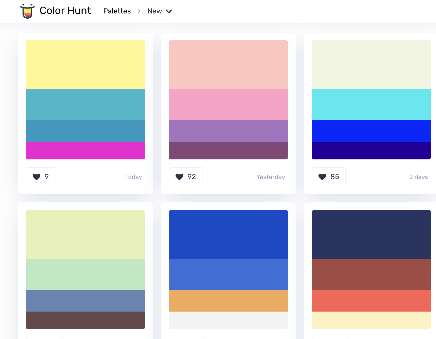
2/ Create your color palette
Match the color palette. Use color picker in XMind to store up desired colors.

If you are not very confident in managing sharp colors, always go with low-saturation colors. They are easy-going to each other and stay harmoniously together.

For more color matching ideas, we recommend Color Hunt. Good news for lazy people :D!
Apply Styles. When you finish adjustment, you can update the style to all the same level topics.

Besides, you can use "copy style" and "paste style" to duplicate the style.

Repetition - Images with unity
The image is an essential part of the mind map. Compared with dry words, a vivid mind map can stimulate the brain to make connections.
When your mind map entails more information, try to enrich it with images. But do remember to select images with a similar style to achieve design unity.

1/ Built-in stickers and markers
XMind 2020's stickers are already available for most of your use cases.

You can also use markers to assign tasks for efficient project management.
2/ Icons by designers
When the local icon is not enough, you can use other free icon resources.
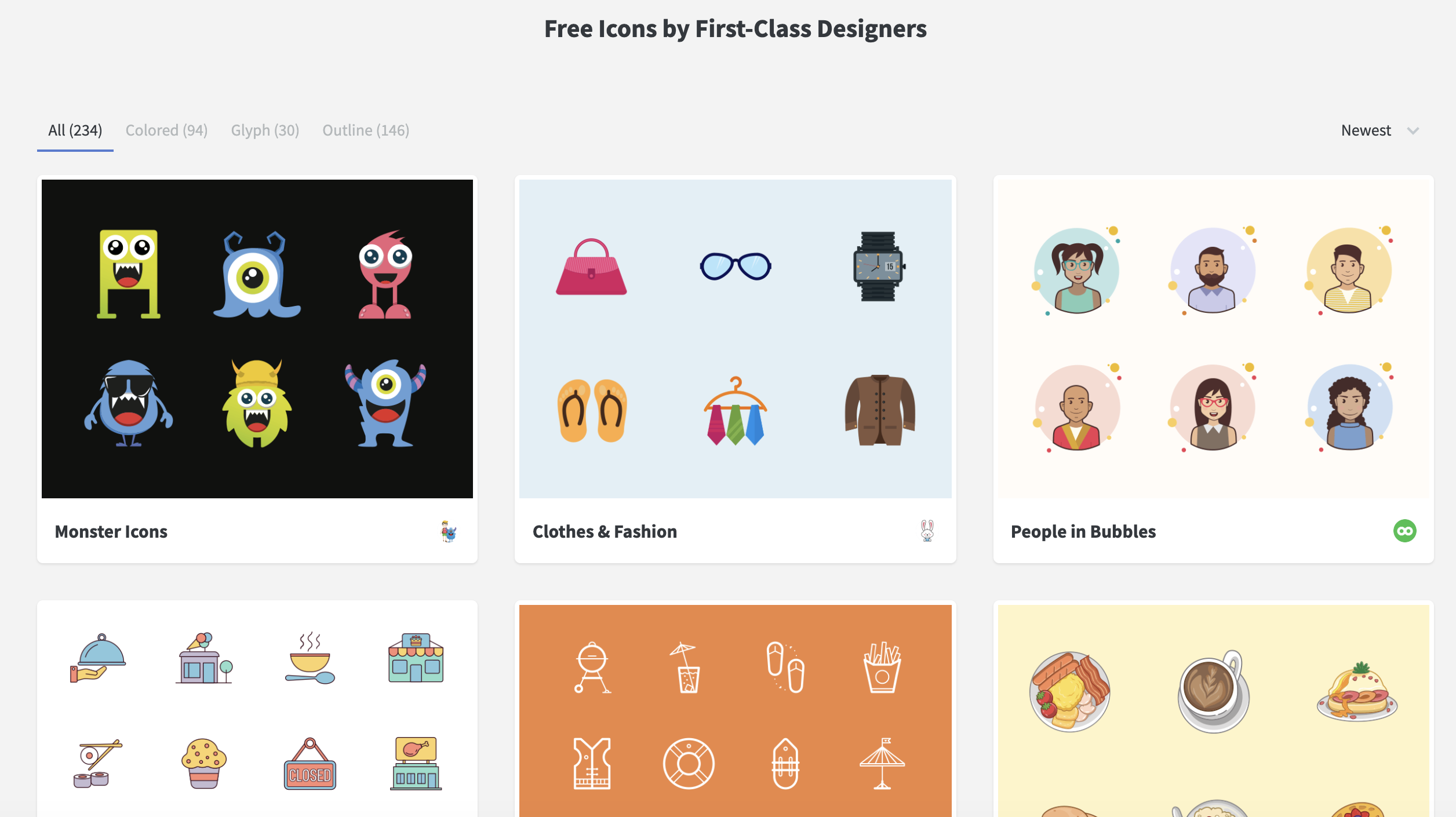
Recommend a few: Flaticon, Noun Project, and Iconstore
3/ Insert GIF animation
We have a tutorial on inserting a GIF animation, check it out if you want to animate your mind maps. We highly recommend GIPHY and Reddit for some funny GIFs. Animaticon is also an excellent choice if you want a set of animated icons.
More tips for beautiful mind maps
Above are just some of the principles and tips for design of mind maps. What are tools that you use for designing mind maps? Share with us at @xmind!
Try Xmind Free