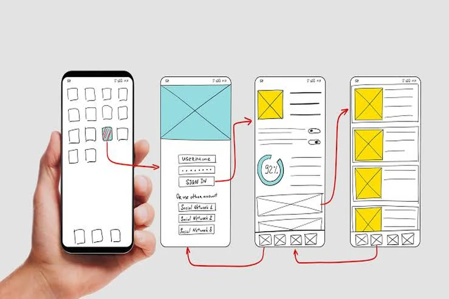
Mobile user experience (UX) is the ease and comfort with which customers can communicate with a business via their mobile phone or tablet. Some ways to enhance mobile UX include optimizing page speed, designing for simple navigation, ensuring responsiveness, making a CTA clear, and making content accessible and checkout processes secure. A good mobile experience will help to minimise frustration and shorten the number of steps required to accomplish the task. Because so many customers study, shopping, interact and pay using their mobile devices, better mobile UX can boost engagement, customer satisfaction, conversions and long-term loyalty.
Mobile isn’t a second channel anymore, for a lot of businesses. It is the first point of contact for customers with a brand. Smartphones are used for product searches, price comparison, reading reviews, contacting support, ordering products and managing accounts.
This puts a clear pressure on companies. Consumers should be able to use a mobile website or app without spending too much attention or getting lost while driving between locations or when using a small-screen device. What may be a nice design on a desktop screen might be very different on a mobile phone.
If mobile UX is poor, it can easily result in lost customers. Slow loading pages, confusing menus, hard-to-find forms and confusing buttons can cause users to abandon their actions.
Fortunately, redesigning an entire business isn’t always the answer to enhancing the mobile user experience. When changes are user-centred, they can make a big difference, even if they’re small.
Understand What Mobile Users Expect
The first principle of good mobile UX is to know how people use their mobile devices. Mobile users can have very different requirements to desktop users. They generally seek information at a hearty pace and they enjoy simple interactions.
For instance, when searching for a local restaurant, they might want the opening times, address, phone number and menu within seconds! An online shopper may wish to do the following: locate a product, verify its price, read vital information, and pay for the product without having to traverse multiple irrelevant pages.
Instead of making assumptions businesses should observe the actual behaviour of real users. Analytics tools can provide a report on which pages get the greatest percentage of mobile visitors, where they go when they leave, and what they are doing when they leave.
Customer feedback is also helpful. Support tickets, reviews, surveys, and usability tests may be able to uncover issues that analytics does not.
There are certain mobile UX expectations that businesses should take into account, such as:
- Quick access to pertinent details
- Easy and straightforward navigation.
- Easy-to-read text
- Hand buttons that are easy to press.
- Consolidate forms that need only limited data entry.Minimize data entry in forms.
- Effective CTAs.
- Fast page loading
- Payments and logins in secure manner
- The design is coherent and uniform across screens.The design is consistent across screens.
Don’t make it more complicated. Its mission is to eliminate all needless friction in the customer’s journey.
Make Mobile Websites Fast And Responsive
The speed of a website directly influences the mobile experience. If the page takes longer to load, users won’t wait as long, particularly those using a mobile data connection or less reliable connection.
Companies need to periodically check their mobile sites and how they are performing, and determine what is slowing them down. The performance can be impacted by large images, scripts that are not necessary, excessive animations, or poor understanding of coding.
One practical starting point is optimizing your images. Images should be compressed without the quality of the image becoming an issue. They can also take advantage of the latest image formats and image sizes to ensure that unnecessary large files aren’t downloaded onto mobile devices.
Content delivery networks (CDN) and caching can also help to optimize load times.
Responsive design is also crucial. Responsive Websites automatically resizes the page for the user. Whether they’re reading on a smartphone or a tablet, the content should be easy-to-read and easy-to-use.
The following are characteristics of a poor mobile layout:
- Horizontal scrolling
- Tiny text
- Overlapping elements
- Too small of spacing between buttons.
- The images that don’t fit into the screen.Screen images that extend beyond.
- Pop-ups which block essential information.
Finally, being fast and responsive should be continuous and not just a technical requirement. After significant changes or updates, businesses should perform a website testing to ensure the new features are not causing any new performance issues.
Simplify Navigation And User Journeys
Mobile screens have smaller surface area as compared to desktop screens. This is a particular importance of navigation.
When a menu is complicated, users may have to spend time trying to find out simple information. Businesses must plan how their menus will be laid out based on customer actions.
For an online business, that may be anything from browsing products, searching, checking the shopping cart and account information. With a service-oriented business, users may require services, pricing, locations, contact information and appointment booking mainly.
It is important that the most important choices are readily accessible. It’s also crucial that businesses stick to familiar navigation patterns rather than developing bizarre interfaces just to make themselves stand out.
The path through a user journey needs to be as straightforward as possible. A customer shouldn’t need to go to a number of unrelated pages to access the booking form.
Properly call to action can steer users. Buttons like Buy Now, Book an Appointment, Get a Quote or Contact Us will instruct users what to do next.
But companies must not have more than a few buttons competing for attention on each screen. Having too many options can lead to confusion.
Remember to ask a question for each critical screen: What is the primary action the user should take on this screen?
The layout can then be designed with that in mind.
Design Forms And Checkout For Mobile
Mobile frustration is easy to come by, especially with forms. Keeping input to a minimum is more difficult with a cell phone than with a real keyboard, so companies should minimize inputs as much as possible.
Having to fill out a form for information the business doesn’t need adds to the frustration. Businesses should go through each of the fields and eliminate any unnecessary information.
Forms should also provide helpful input types. For instance, a phone number field should display a numeric keypad if it is to be used to enter a phone number. Mobile keyboard settings are available for email fields in case they want to be easier to enter an email address.
Error messages should be informative and near the field in question. The “Invalid input” message should contain a correction message instead of just stating that the input is invalid.
For ecommerce businesses, checkout is a crucial area that deserves special attention. The steps involved in placing an order should be kept to a minimum such that the customer can view his/her order, the total cost, the means of payment, and finalise the purchase without unnecessary delays.
To enhance mobile checkout, businesses can:
- Offering guest checkout
- Roughly half the form fields are removed.
- Offering several safe payment methods.
- Clearly displaying shipping costs
- Demonstrating the amount of the order prior to payment.
- Allowing mistakes to be easily comprehended
- Avoiding unexpected redirects
- Providing confirmation after payment
Faster checkout could help decrease cart abandonment and give customers a more pleasant buying experience on their cellphones.
Improve Accessibility, Trust, And Personalization
As many users as possible need to be able to use good mobile UX. Accessibility is more than a compliance issue. It also can help make digital experiences more user-friendly for all.
The contrast between the text and background should be sufficient, and if there is a large amount of text to be read, zooming should be done minimally. Any interactive components should be easy to tap with the finger. Images that convey important information should have appropriate other text.
It’s also important to focus on screen-reader users and other assistive technology users. Making labels clear, forms accessible and logical page structures can make a significant difference.
Another crucial aspect of mobile UX is trust. If they feel a site is outdated or insecure, customers may not be willing to provide their personal or payment details.
To build trust, businesses should make it clearly visible to the customer that:
- Secure payment information
- Privacy policies
- Contact details
- Return or refund policies
- Customer reviews
- Business information
- Clear pricing
When it’s useful and being used responsibly, personalization can enhance the experience. For instance, a mobile application can keep track of a user’s preferred shipping address or previously looked at items. This can help save time, without being intrusive.
The central premise is using customer information to make things simpler, rather than gathering more information.
Test, Measure, And Improve The Mobile Experience
Mobile UX is never complete. After updates, customer behavior changes, devices change and new technical issues may emerge.
Companies should set up a regular testing process. This can involve testing across various screen sizes, operating systems, browsers and network conditions.
User feedback can be particularly beneficial from real users. For a business, it may be simple to understand one feature, and for the users, it is very different.
Usability testing is the process of finding problems like labeling that is not clear, confusing navigation, checkout steps that are difficult, etc., or if the user doesn’t notice buttons.
Analytics can then be used to gauge if improvements are effective?
Some relevant mobile UX metrics are:
- Mobile conversion rate
- Bounce rate
- Cart abandonment rate
- Average session duration
- Page load performance
- Form completion rate
- Customer retention
- App engagement
- Support requests related to usability
These metrics should be compared before and after significant UX changes for businesses. That way, you can tell that there could be real enhancements, and that you’re just seeing something new appear nicer.
A/B testing may also be beneficial. For instance, a business may test two different versions of a checkout button or landing page to find out which has generated more completed actions.
The best way is usually to undergo continuous improvement. Define a problem, trial a solution, evaluate the results, and improve the experience as necessary.
Final Thoughts
Enhancing the Mobile User Experience is all about making digital interactions easier, faster and more useful. Focusing solely on the visual aspect of the design can lead businesses to overlook the issues that are most significant to customers.
The first step to a great mobile experience is knowing what customers need. Businesses can, from there, optimize page speed, streamline navigation, decrease form friction, make more clear CTAs, boost accessibility and build trust all through the customer journey.
Finally, don’t forget that a responsive website is not the only thing associated with mobile UX. It encompasses all consumer transactions on a mobile device, from initial search through to the last purchase and after-sales service.
Don’t have to make everything change. They can begin by looking at the most significant pain points and concentrating on those first. Continuous testing and feedback from customers can then inform future changes.
The mobile-first world demands a simple and reliable user experience, or else, a customer will go elsewhere. Engaging in mobile UX as part of their daily business operations can help businesses enhance user experiences, boost engagement rates, drive conversions and foster customer loyalty.